Product Design · 2025
consiligiere
cover.webp
summary.txt
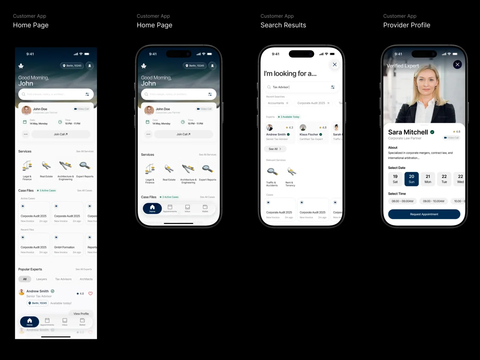
A product concept for Consiligiere, a marketplace where people find and book verified lawyers, notaries, architects and surveyors. Eylül and Ulaş took it from the founder's brief to a visual direction, a landing page and both sides of the app, for the founder's investment round.
brief.md
The founder came with a PRD that already named the colors and typefaces, but the product didn't exist yet. Investors had to see it: how someone finds the right professional and books them, and how that professional runs their practice on the platform.
process.md
A two-sided marketplace concept, designed with Ulaş Alyeşil on every phase, from concept to execution.
We started by testing the brief instead of following it. The PRD asked for Cinzel, so we set the name in Cinzel, in a condensed serif and in a sans, and looked at them side by side.
01.webp
More than twenty landing pages followed. The first moved away from the brief: warm cream, and one earthy color per profession, so people could find real estate by its terracotta. Gradients and a lighter "super-app" version came next.
02.webp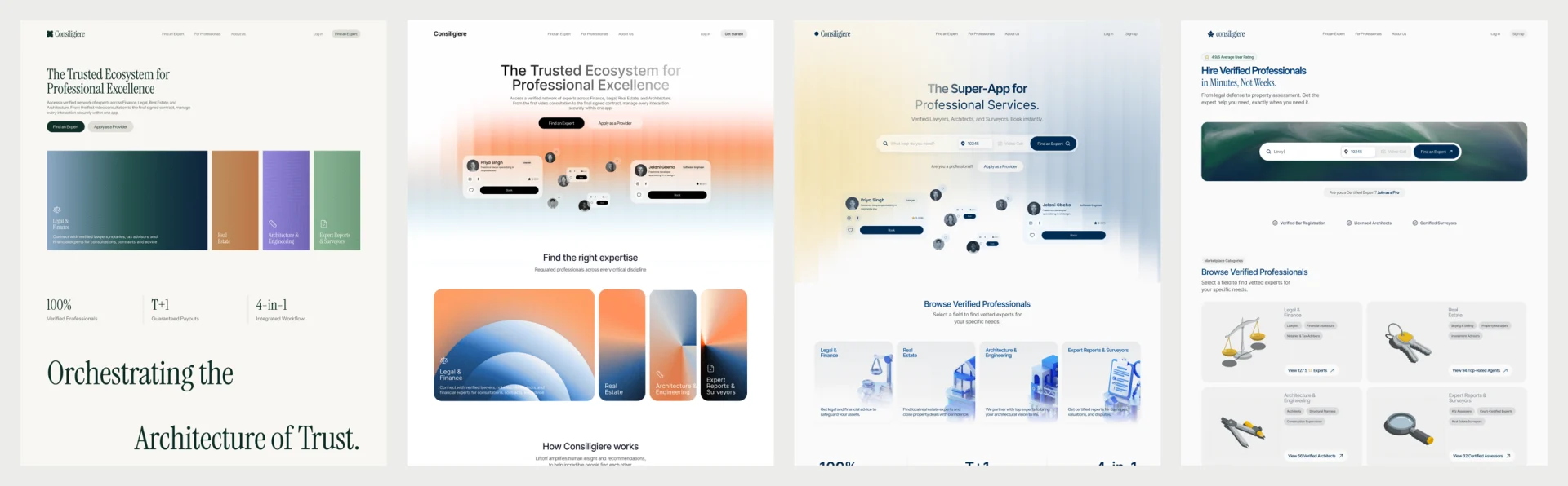
Then we reworked the palette around who the product is for and how it needs to be seen: a serious place for legal and financial work. Navy came back, and each profession got an object instead of a color: scales, keys, a compass, a magnifying glass.
Cinzel's limited character set didn't hold up in a real product, so Instrument Serif took over the headlines, with Inter Display for everything else. The palette grew from three colors into full scales.
03.webp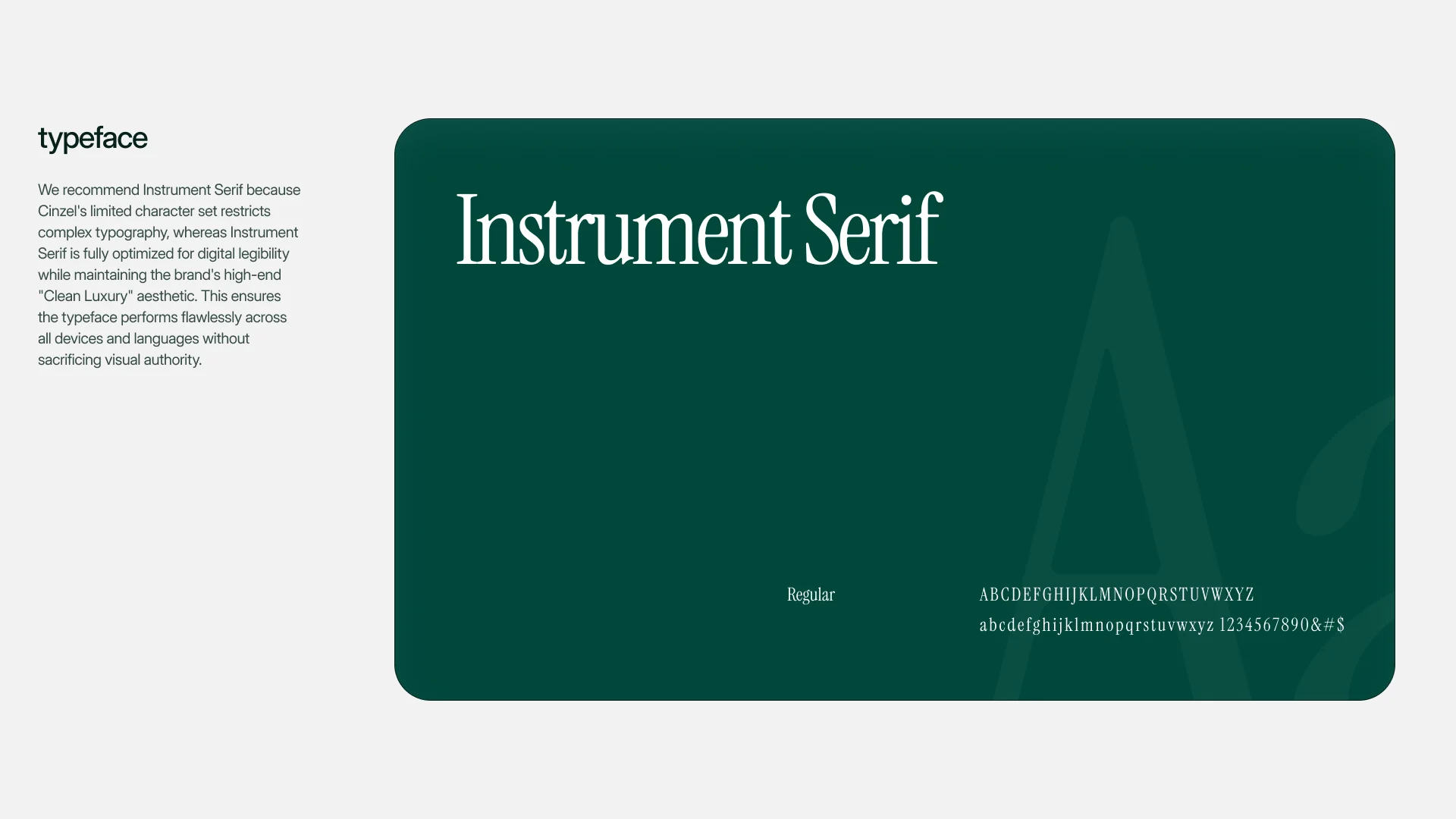
04.webp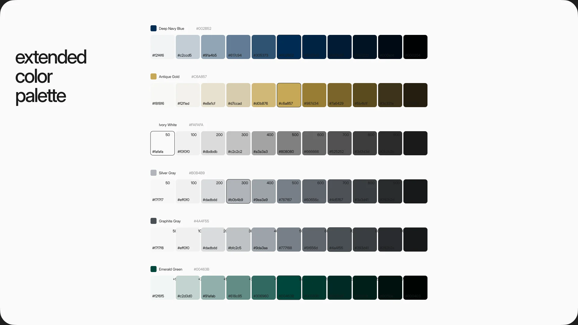
On the customer side, booking lives on the provider's profile: pick a day, pick a time, request the appointment. Filters start from what people ask first: price, availability, a free first call, rating.
05.webp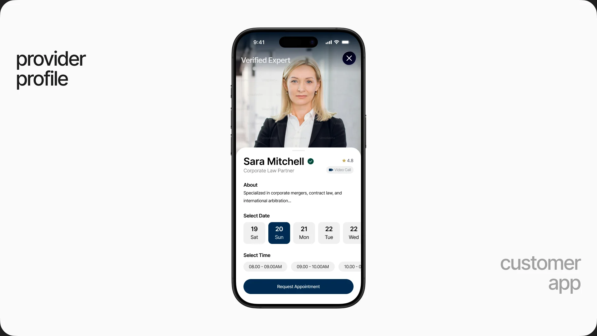
06.webp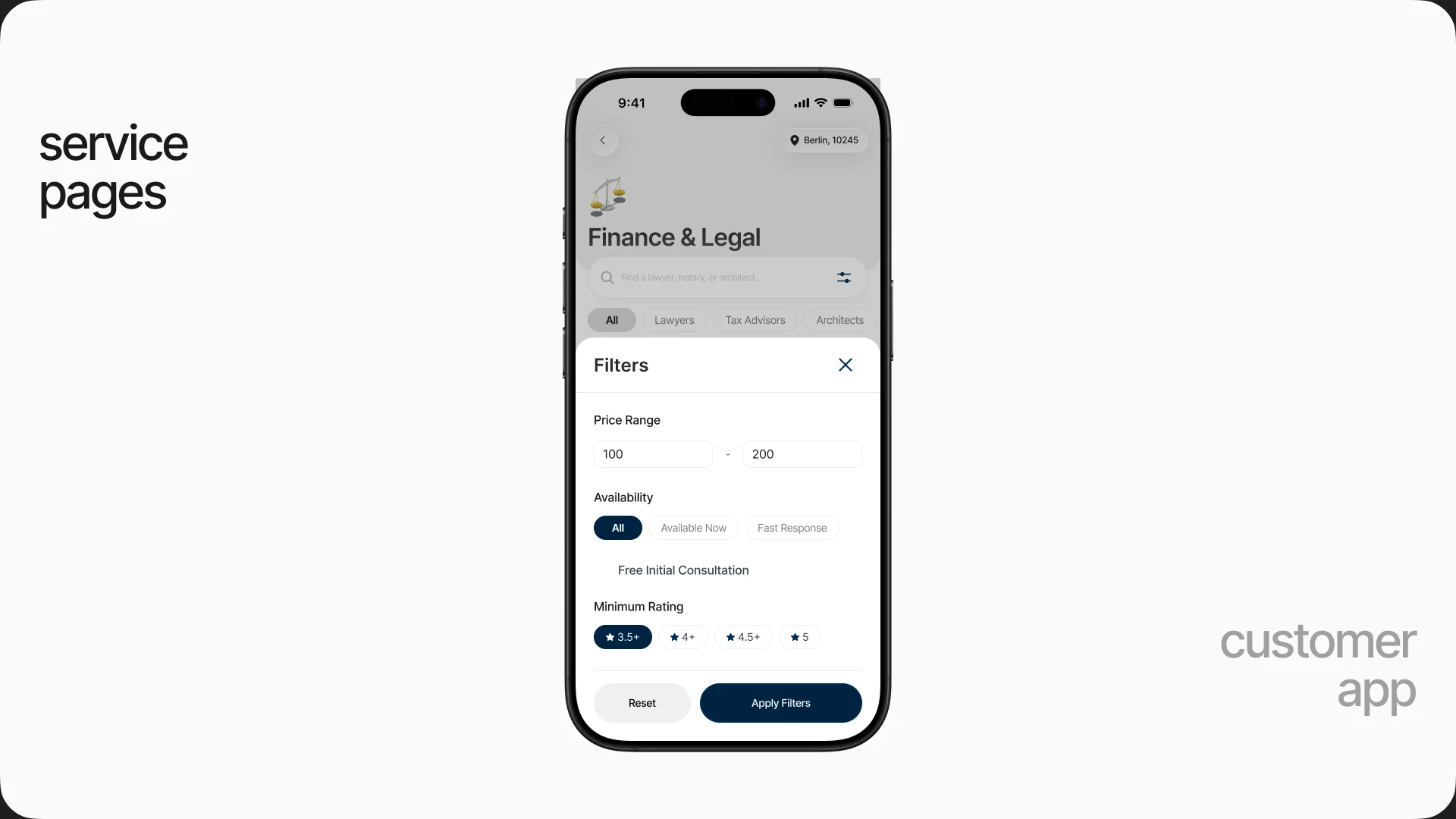
The provider side had to give professionals a reason to stay on the platform after the first client: pending revenue, mandates waiting for a signature, deadlines due today, on the phone and on the web.
07.webp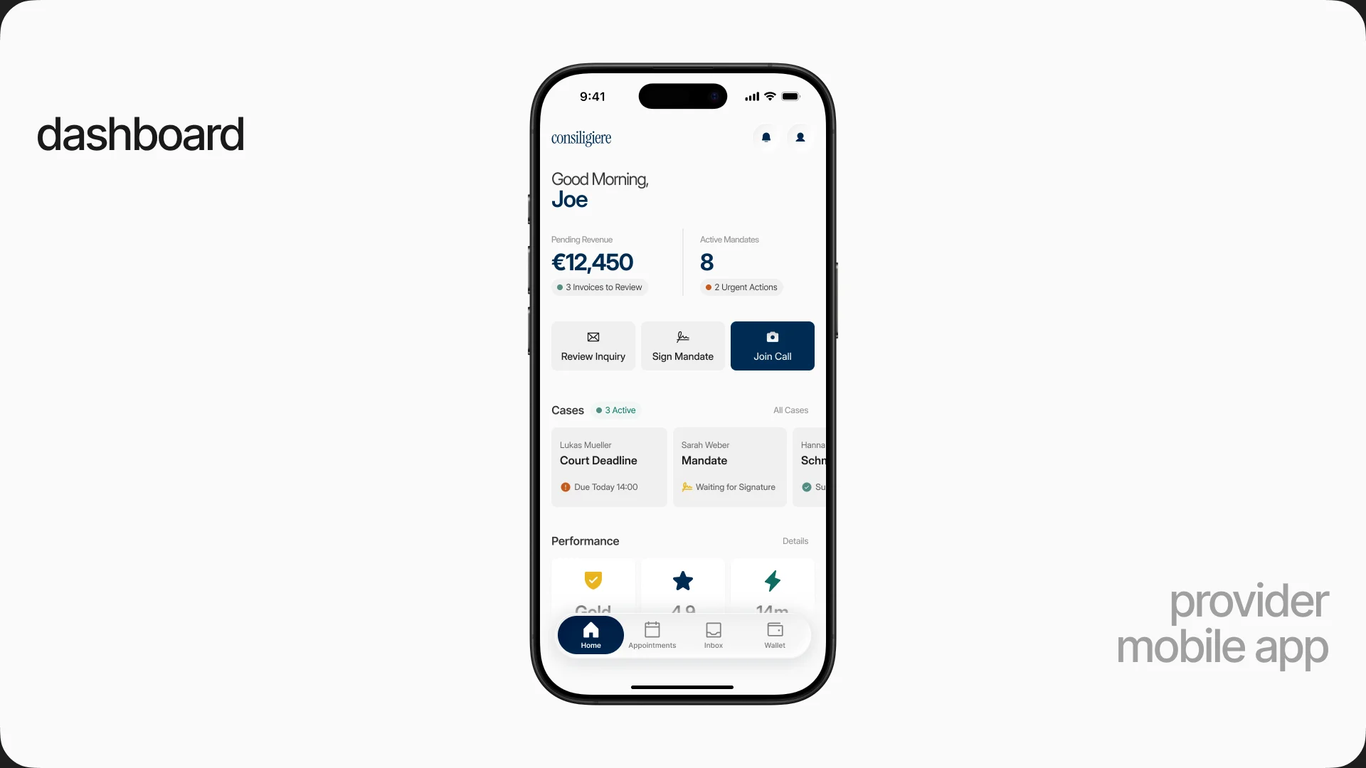
08.webp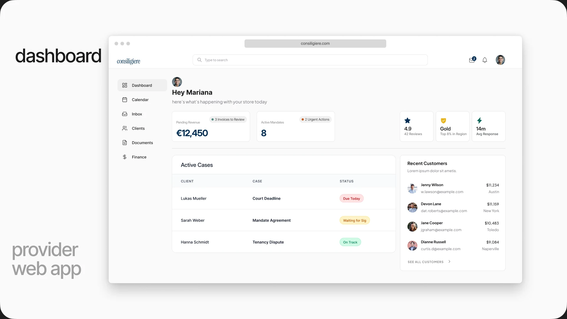
09.webp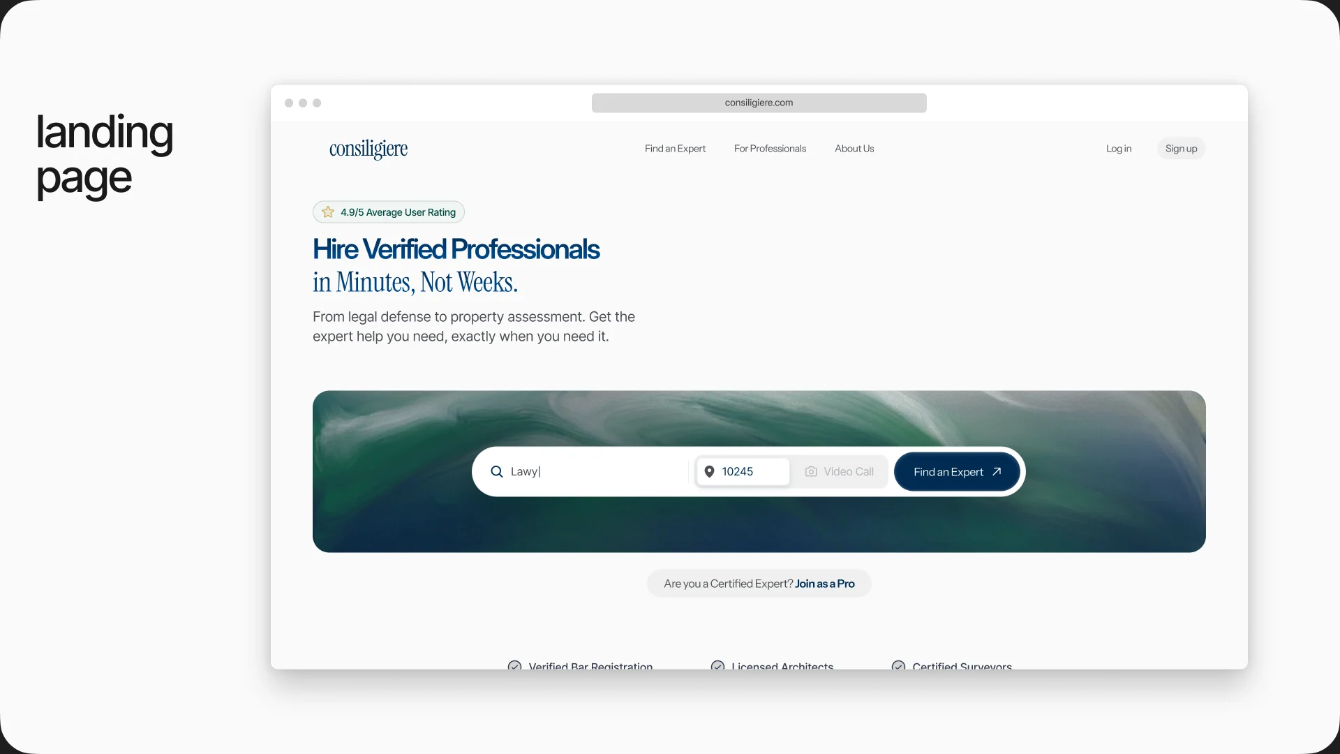
see-also